Interrupted Time Series (ITS) in Python
When A/B test is not an option


The gold standard for statistically asserting the effectiveness of an intervention is the randomized controlled experiment and its simplified online variant: the A/B test.
📝 During an A/B test there are two almost identical versions of a product, simultaneously running, that only differ by the hypothesis you want to test ( i.e can a red call to action button convert more than a blue one? ). Users are randomly chosen to experience one (and only one) of the two versions while the experiment is active.
They are easy to understand, easy to setup (great free tools easily available) and when correctly designed they rule out any covariate differences between the groups.
However, sometimes it's just not possible to set up an A/B test:
Technical difficulties. Sometimes a change is so widespread and complex that it would be technically impossible to keep two different versions running simultaneously.
Business strategy. A new feature rollout will be available first to some countries and later for others.
Ethical concerns. Having a subset of customers having access to a feature or bug fix that gives them a competitive advantage over others that don't.
Legal or regulatory requirements. A change in regulations becomes mandatory ( i.e. GPDR compliance ) and should be applied to all your customers of a given country at the same time.
Temporal infeasibility. You want to analyze an event that has already happened ( i.e. How last Google's search algorithm update impacted your sales funnel? ).
Quasi Experiments

If you can't do an A/B test then the second to best alternative are quasi experiments [1].
In a quasi experiment, your treatment and control group are not divided by a completely random process but by a natural process (i.e. time, location, etc) therefore there is a much larger chance for imbalance due to skewness and heterogeneous differences. The results of a quasi-experiment won’t be as precise as an A/B, but if carefully conducted could be considered close enough to compute estimates.
There are some scenarios, like some described in the previous section, where having a control group in parallel to a test group is just not possible, and this is when Interrupted Times Series comes in very handy.
Interrupted Time Series (ITS)
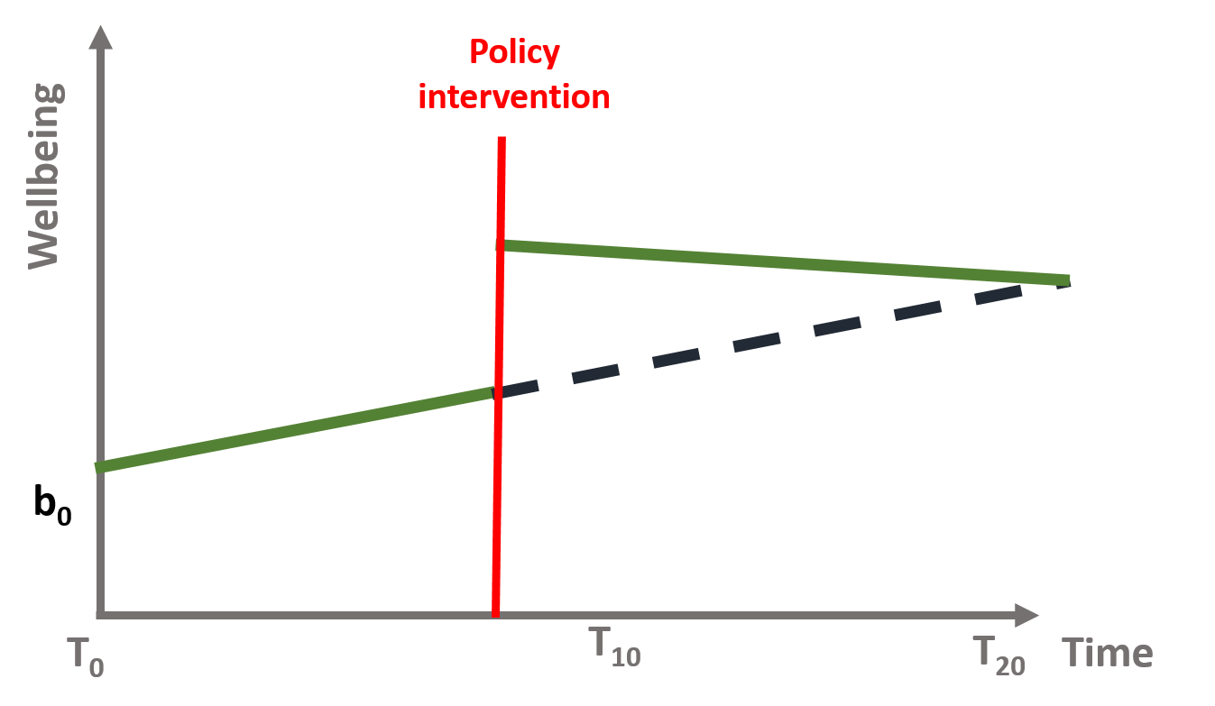
Interrupted time series (ITS) is a method of statistical analysis involving tracking a period before and after a intervention at a known point in time to assess the intervention's effects within a single group/population. The time series refers to the data over the period, while the interruption is the intervention, which is a controlled external influence or set of influences. Effects of the intervention are evaluated by changes in the level and slope of the time series and statistical significance of the intervention parameters[2]. The more observations you have before and after the intervention, the more robust your model will be (typically). Because the evaluation is based on observing a single population over time, the ITS design is free from problems due to between-group difference but are susceptible to time-varying confounders like other interventions occurring around the time of the intervention that may also affect the outcome[3].
👍 Strengths of Interrupted Time Series include the ability to control for secular trends in the data (unlike a 2-period before-and-after \(t\)-test), ability to evaluate outcomes using population-level data, clear graphical presentation of results, ease of conducting stratified analyses, and ability to evaluate both intended and unintended consequences of interventions.
👎 Limitations of Interrupted Time Series include the need for a minimum of 8 time periods before and 8 after an intervention to evaluate changes statistically, difficulty in analyzing the independent impact of separate components of a program that are implemented close together in time, and existence of a suitable control population.
In mathematical terms, it means that the time series equation (1) includes four key coefficients:
\begin{equation} Y = b_0 + b_1T + b_2D + b_3P + \epsilon \end{equation}
Where:
\(Y\) is the outcome variable;
\(T\) is a continuous variable which indicates the time passed from start of the observational period;
\(D\) is a dummy variable indicating observation collected before (\(D=0\)) or after (\(D=1\)) the intervention;
\(P\) is a continuous variable indicating time passed since the intervention has occurred (before intervention has occurred \(P\) is equal to \(0\));
With \(\epsilon\) representing a zero-centered gaussian random error.
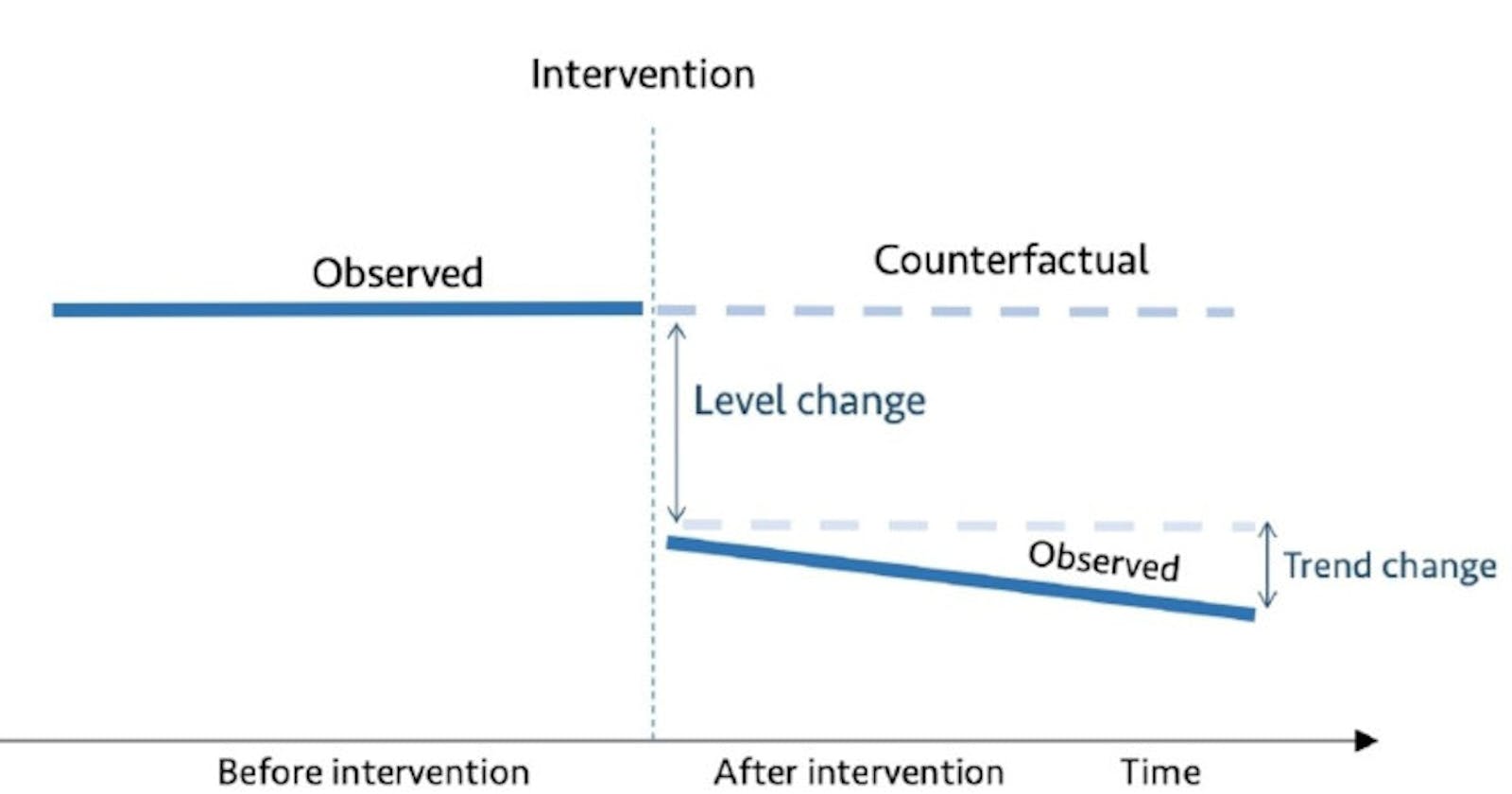
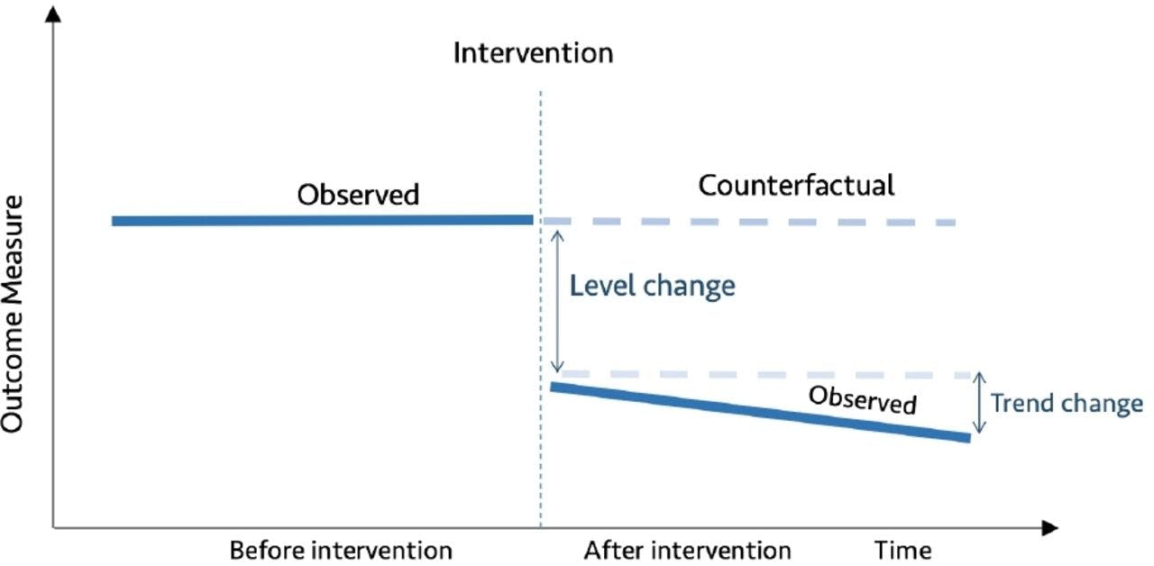
Counterfactual

In an ITS it is important to understand the counterfactual. The counterfactual refers to what it would have occurred to Y, had the policy intervention not happened.
📝Counterfactuals are simply ways of comparing what happens given a change, versus what should have happened had some change not occurred in the first place.
In a randomized trial or A/B test we know the counterfactual average outcome because the experiment withheld the intervention from the control group (which by randomization is somewhat the same as the intervention group). A critical assumption in ITS is that the outcome of interest trend would remain unchanged in the absence of intervention.
A practical example
Bob runs a large and successful blog on personal finance. During a webinar he learns that making his web content load faster could reduce its bounce rate and therefore decides to sign up for a CDN service. It's been 6 months since he added a CDN to his blog and he wants to know if the investiment he did reduced the bounce rate.
Dataset
Bob provides us with 🗒️ 24 weeks of data before adding the CDN and 24 weeks after it (intervention). Therefore, weeks 1 to 24 have a bouncing rate before intervention and weeks 25 to 48 after it.
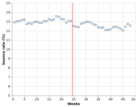
Visually, it looks like after enabling the CDN the bounce rate decreased, but by how much, and does it have statistical significance? To answer this question using interrupted time series analysis, we first need to prepare our data.
Dataset preparation
Using equation (1) notation we 🗒️ enrich this data with values for columns \(D\) (0 = before intervention, 1 after) and \(P\) (number of weeks since intervention started):
| Bouncing rate (Y) | Week (T) | Intervention (D) | Intervention week (P) |
| 12.92 | 1 | 0 | 0 |
| 13.03 | 2 | 0 | 0 |
| 13.06 | 3 | 0 | 0 |
| 13.17 | 4 | 0 | 0 |
| ... | ... | ... | ... |
| 12.04 | 45 | 1 | 21 |
| 12.45 | 46 | 1 | 22 |
| 12.74 | 47 | 1 | 23 |
| 12.57 | 48 | 1 | 24 |
Naive solution
Let's implement an ordinary least squares (OLS) regression using statsmodels to measure the impact of our intervention:
import pandas as pd
import statsmodels.api as sm
import statsmodels.formula.api as smf

df = pd.read_csv("enriched_data.csv")

model = smf.ols(formula='Y ~ T + D + P', data=df)
res = model.fit()
print(res.summary())
With output:
                            OLS Regression Results
==============================================================================
Dep. Variable:                      Y   R-squared:                       0.666
Model:                            OLS   Adj. R-squared:                  0.643
Method:                 Least Squares   F-statistic:                     29.18
Date:                Tue, 28 Dec 2021   Prob (F-statistic):           1.52e-10
Time:                        14:33:50   Log-Likelihood:                 4.8860
No. Observations:                  48   AIC:                            -1.772
Df Residuals:                      44   BIC:                             5.713
Df Model:                           3
Covariance Type:            nonrobust
==============================================================================
                 coef    std err          t      P>|t|      [0.025      0.975]
------------------------------------------------------------------------------
Intercept     12.9100      0.096    134.225      0.000      12.716      13.104
T              0.0129      0.007      1.920      0.061      -0.001       0.026
D             -0.5202      0.132     -3.942      0.000      -0.786      -0.254
P             -0.0297      0.010     -3.115      0.003      -0.049      -0.010
==============================================================================
Omnibus:                        3.137   Durbin-Watson:                   0.665
Prob(Omnibus):                  0.208   Jarque-Bera (JB):                1.995
Skew:                           0.279   Prob(JB):                        0.369
Kurtosis:                       2.172   Cond. No.                         125.
==============================================================================
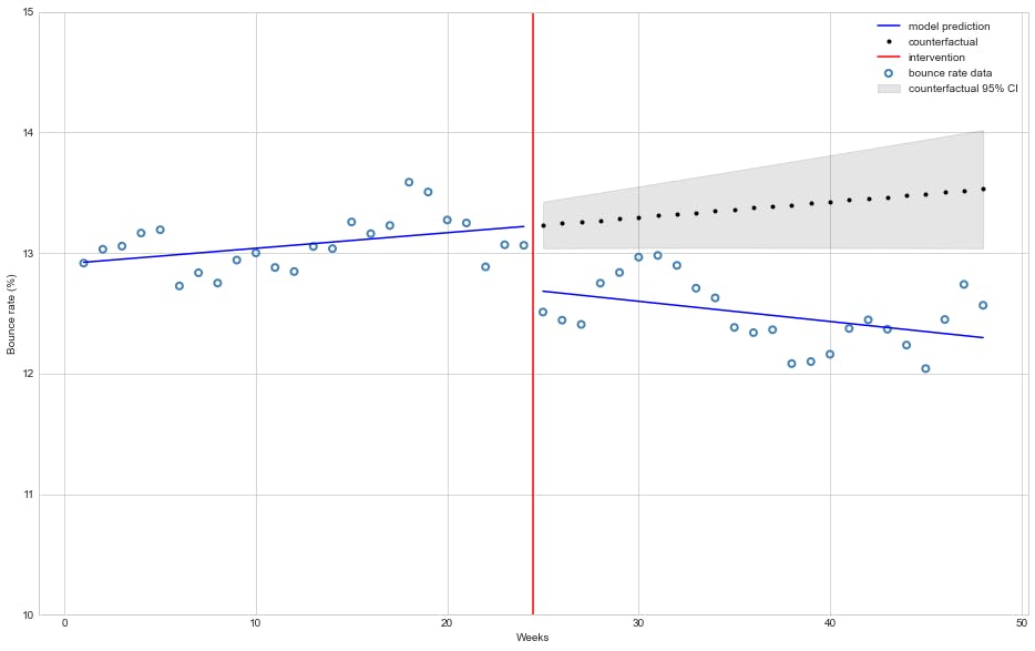
The model estimates that the bounce rate decreased 🔻 0.52% and this effect is statistically significant (\(P>|t|\) is virtually zero).
It is also noteworth that the model estimates a small (on average 🔻 0.0297%) but with statistical significance trend of a decrease in bounce rate each week after intervention, which is unexpected since the CDN serves the whole website just a few hours after activation.
The figure bellow depicts how the model fits before and after intervention and how it project a counterfactual would be:
start = 24
end = 48
beta = res.params

# Get model predictions and 95% confidence interval
predictions = res.get_prediction(df)
summary = predictions.summary_frame(alpha=0.05)

# mean predictions
y_pred = predictions.predicted_mean

# countefactual assumes no interventions
cf_df = df.copy()
cf_df["D"] = 0.0
cf_df["P"] = 0.0

# counter-factual predictions
cf = res.get_prediction(cf_df).summary_frame(alpha=0.05)

# Plotting
plt.style.use('seaborn-whitegrid')
fig, ax = plt.subplots(figsize=(16,10))

# Plot bounce rate data
ax.scatter(df["T"], df["Y"], facecolors='none', edgecolors='steelblue', label="bounce rate data", linewidths=2)

# Plot model mean bounce rate prediction
ax.plot(df["T"][:start], y_pred[:start], 'b-', label="model prediction")
ax.plot(df["T"][start:], y_pred[start:], 'b-')

# Plot counterfactual mean bounce rate with 95% confidence interval
ax.plot(df["T"][start:], cf['mean'][start:], 'k.', label="counterfactual")
ax.fill_between(df["T"][start:], cf['mean_ci_lower'][start:], cf['mean_ci_upper'][start:], color='k', alpha=0.1, label="counterfactual 95% CI");

# Plot line marking intervention moment
ax.axvline(x = 24.5, color = 'r', label = 'intervention')

ax.legend(loc='best')
plt.ylim([10, 15])
plt.xlabel("Weeks")
plt.ylabel("Bounce rate (%)");
Problems with naive approach

OLS (Ordinary Least Squares) regression has seven main assumptions but for brevity in this article we will focus on two only:
- Individual observations are independent.
- Residuals follow a normal distribution.
Let's first check for the normality of residuals:
We can apply the Jarque-Bera test on residuals to checks whether their skewness and kurtosis match a normal distribution (\(H_0\): residual distribution follows a normal distribution). Our statsmodels OLS summary output shows a Prob(JB): 0.369 which for a standard \(\alpha\) level of 0.05 doesn't allow us discard null
hypothesis (\(H_0\)).
Let's plot the distribution of residuals:
res.resid.plot(kind="kde")
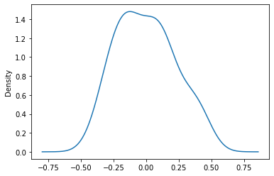
Which for a small dataset (less than 50 points) looks sufficiently gaussian.
Overall, the assumption of normality of residuals can't be convincingly refuted. ✅
Checking independence of observations:
The Durbin-Watson statistic test if the residuals are correlated with its immediate predecessor, that is, if they have an autocorrelation at lag 1 or \(AR(1)\). Its value ranges from 0 to 4 and values smaller than 1.5 indicate a positive autocorrelation, while values greater than 2.5 signal a negative autocorrelation.
If we take a look again at our OLS summary output we will observe that the Durbin-Watson statistic has a value of 0.665 which signals a strong positive \(AR(1)\).
Let's plot the residuals to see if we can observe this autocorrelation:
import altair as alt

rules = alt.Chart(pd.DataFrame({
  'residuals': [0.0],
  'color': ['black']
})).mark_rule().encode(
  y='residuals',
  color=alt.Color('color:N', scale=None)
)

residual_plot = alt.Chart(res_df).mark_point().encode(
    x=alt.X('Weeks'),
    y=alt.Y('residuals')
)

rules + residual_plot
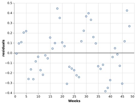
Notice how residuals above/bellow zero have most points temporally close to it also above/bellow zero as well, which goes against the independence of observations assumption of OLS ❌.
📝In practice when analyzing time series data the presence of autocorrelation is the rule instead of the exception since in general the factors that contributed to a given observation tend to persist for a while.
Autoregressive model solution
The autoregressive model specifies that each observation depends linearly on previous observations.
Thus, an autoregressive model of order \(p\) (\(AR(p)\)) can be written as
\begin{equation} y_t = c + \phi1 y{t-1}+ \dots + \phip y{t-p} + \epsilon_t \end{equation}
Where:
\(y_t\): observation at time \(t\),
\(y_{t-i}\): observation at time \(t - i\),
\(\phii\): coefficient of how much observation \(y{t - i}\) correlates to \(y_t\),
\(\epsilon_t\): white noise ( \(\mathcal{N}(0, \sigma²)\) ) at time \(t\).
Autocorrelation
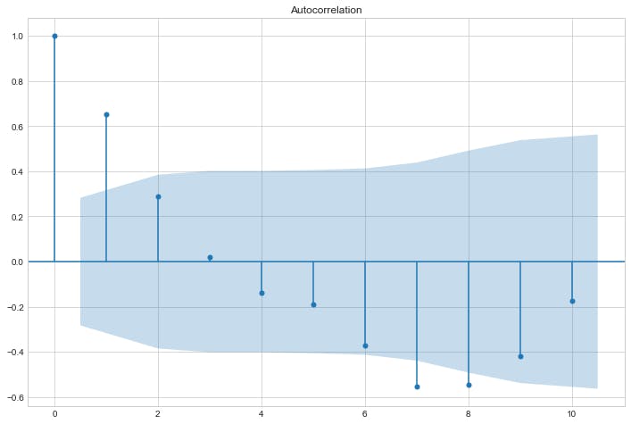
To assess how much an observation correlates with past observations, it is useful to do an autocorrelation plot as shown below:
sm.graphics.tsa.plot_acf(res.resid, lags=10)
plt.show()
Partial Autocorrelation
The partial autocorrelation at lag \(p\) is the correlation that results after removing the effect of any correlations due to the terms at shorter lags.
sm.graphics.tsa.plot_pacf(res.resid, lags=10)
plt.show()
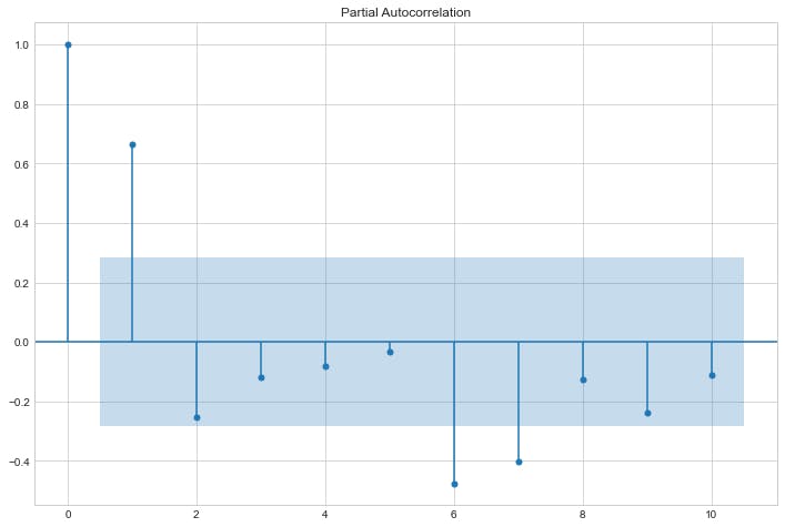
Model selection
The theory states that in an autoregressive model its autocorrelation plot should depict an exponential decay and the number of lags \(p\) should be taken from the partial autocorrelation chart using its \(p\) most relevant lags. Applying the theory to our plots above, we conclude that our model is autoregressive of lag 1 also known as AR(1).
ARIMA
In statistics ARIMA stands for autoregressive integrated moving average model and as can be inferred by the name AR models are as especial case of ARIMA therefore AR(1) is equivalent to ARIMA(1,0,0).
We can model an AR(1) process to our dataset using statsmodels ARIMA as bellow:
from statsmodels.tsa.arima.model import ARIMA

arima_results = ARIMA(df["Y"], df[["T","D","P"]], order=(1,0,0)).fit()
print(arima_results.summary())
Output:
                               SARIMAX Results
==============================================================================
Dep. Variable:                      Y   No. Observations:                   48
Model:                 ARIMA(1, 0, 0)   Log Likelihood                  18.574
Date:                Thu, 30 Dec 2021   AIC                            -25.148
Time:                        01:51:46   BIC                            -13.921
Sample:                             0   HQIC                           -20.905
                                 - 48
Covariance Type:                  opg
==============================================================================
                 coef    std err          z      P>|z|      [0.025      0.975]
------------------------------------------------------------------------------
const         12.9172      0.279     46.245      0.000      12.370      13.465
T              0.0121      0.016      0.767      0.443      -0.019       0.043
D             -0.5510      0.273     -2.018      0.044      -1.086      -0.016
P             -0.0238      0.021     -1.155      0.248      -0.064       0.017
ar.L1          0.6635      0.138      4.803      0.000       0.393       0.934
sigma2         0.0267      0.006      4.771      0.000       0.016       0.038
===================================================================================
Ljung-Box (L1) (Q):                   1.00   Jarque-Bera (JB):                 0.15
Prob(Q):                              0.32   Prob(JB):                         0.93
Heteroskedasticity (H):               1.44   Skew:                            -0.05
Prob(H) (two-sided):                  0.47   Kurtosis:                         3.25
===================================================================================
The autoregressive model estimates that the bounce rate decreased 🔻 0.55% on average and this effect is statistically significant (\(P>|t| = 4.4\% \), less than our \(\alpha = 5\% \)).
However, unlike the previous OLS model, the autoregressive model does not estimate a statistical significance trend of a decrease in bounce rate each week after intervention, which is in line with our expectations.
The models estimates (with counterfactual projections) can be seen in the chart below:
from statsmodels.tsa.arima.model import ARIMA

start = 24
end = 48

predictions = arima_results.get_prediction(0, end-1)
summary = predictions.summary_frame(alpha=0.05)

arima_cf = ARIMA(df["Y"][:start], df["T"][:start], order=(1,0,0)).fit()

# Model predictions means
y_pred = predictions.predicted_mean

# Counterfactual mean and 95% confidence interval
y_cf = arima_cf.get_forecast(24, exog=df["T"][start:]).summary_frame(alpha=0.05)

# Plot section
plt.style.use('seaborn-whitegrid')
fig, ax = plt.subplots(figsize=(16,10))

# Plot bounce rate data
ax.scatter(df["T"], df["Y"], facecolors='none', edgecolors='steelblue', label="bounce rate data", linewidths=2)

# Plot model mean bounce prediction
ax.plot(df["T"][:start], y_pred[:start], 'b-', label="model prediction")
ax.plot(df["T"][start:], y_pred[start:], 'b-')

# Plot counterfactual mean bounce rate with 95% confidence interval
ax.plot(df["T"][start:], y_cf["mean"], 'k.', label="counterfactual")
ax.fill_between(df["T"][start:], y_cf['mean_ci_lower'], y_cf['mean_ci_upper'], color='k', alpha=0.1, label="counterfactual 95% CI");


# Plot line marking intervention moment
ax.axvline(x = 24.5, color = 'r', label = 'intervention')

ax.legend(loc='best')
plt.ylim([10, 15])
plt.xlabel("Weeks")
plt.ylabel("Bounce rate (%)");
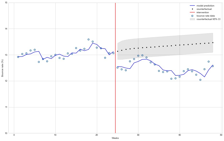
We can clearly see that the ARIMA(1, 0, 0) model fits our dataset better than the OLS model.
ARIMA residual analysis
The summary of our autoregressive model shows a Prob(JB): 0.93 which is compatible with the null-hypothesis of normaly distributed residuals. ✅
The Ljung-Box Q test verifies whether the residuals are independently distributed (they exhibit no serial autocorrelation) as \(H_0\) (null-hypothesis). As the Prob(Q): 0.32 is way above the standard \(\alpha = 0.05\) there is no evidence of serial autocorrelation in the ARIMA residuals. ✅
Let's now take a look at residuals qqplot to check if they follow a normal distribution:
import scipy as sp
from statsmodels.graphics.gofplots import qqplot
fig, (ax1, ax2) = plt.subplots(1,2, figsize=(16,8))
sm.qqplot(res.resid, sp.stats.t, fit=True, line="45", ax=ax1);
ax1.set_title("OLS qqplot");
sm.qqplot(arima_results.resid, sp.stats.t, fit=True, line="45", ax=ax2);
ax2.set_title("ARIMA qqplot");
plt.show();
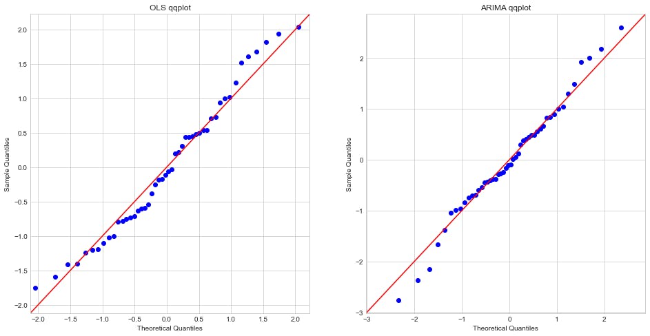
We may observe that the ARIMA(1,0,0) model residuals not only are in general normally distributed as they fit better than the OLS model the theoretical quantiles. ✅
Summary
A/B tests are a the most powerful and trustworthy method to do measure the impact of modifications/changes even before they are fully implemented, which is why they are so widely used.
However, there are some scenarios where A/B tests are not feasible and this is when the knowledge of quasi-experiments becomes valuable to get statistically sound measurements of change impact.
In this post we have shown why an ordinary least square (OLS) linear regression is not a good modeling approach for time series data since they usualy present non-negligible autocorrelation that violates some assumptions of OLS.
We demonstrated with an example how to use python (statsmodels, matplotlib, altair and pandas) to visualize residuals and plot autocorrelation and partial autocorrelations charts to figure out the lag of an autoregressive model and then implemented a ARIMA model using statsmodels to observed a more accurate and precise analysis and how to interpret statsmodels model output for OLS and ARIMA.
We also showed how to plot in a single chart the models estimates (mean and 95% confidence interval) for the time periods before and after intervention and its respective counterfactual.
References
[1] Shopify Engineering: How to Use Quasi-experiments and Counterfactuals to Build Great Products.